Whether you're hosting a conference, trade show, or corporate event, thoughtfully designed badges can make introductions smoother, conversations more natural, and connections more meaningful. If your goal is to improve networking at your event, focusing on simplicity, clarity, and bold text is essential.
Event badges are often the first point of interaction between attendees. Before a handshake or introduction, people glance at a badge to quickly gather information. If that information is hard to read or cluttered, it creates friction. On the other hand, a well-designed badge acts as a conversation starter and lowers social barriers.
In fast-paced environments, attendees don’t have time to squint or decode tiny fonts. Your badge design should support quick recognition and encourage engagement.
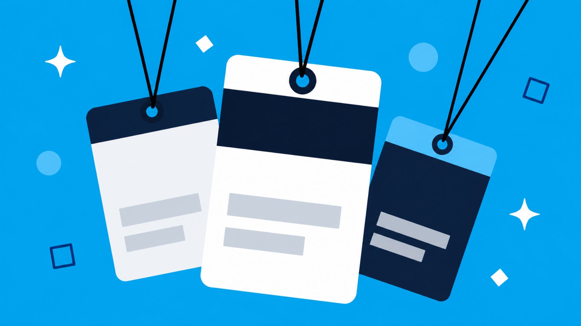
When it comes to badge design, less is more. Overloading badges with too many elements—like excessive text, multiple QR codes, or unnecessary details—can overwhelm the viewer. Instead, prioritize only the most important information:
That said, simple and clearly visible sponsor logos can be a valuable addition. When thoughtfully placed, they don’t detract from readability and can actually enhance the badge’s professional look. Including sponsor logos also creates an additional revenue opportunity for your event, offering sponsors meaningful visibility without compromising the attendee experience.
By keeping the layout clean and intentional, you make it easier for others to quickly identify who they’re speaking with. Simplicity reduces hesitation and helps people jump straight into conversation.
Clarity goes hand in hand with simplicity. Even if you include the right information, poor formatting can make it ineffective. Use clean fonts, proper spacing, and strong contrast between text and background.
Avoid overly decorative fonts or color combinations that strain the eyes. For example, light gray text on a white background might look stylish, but it’s difficult to read in real-world lighting conditions.
Clear badges ensure that names and key details can be read from a comfortable distance—typically 3 to 6 feet. This allows attendees to prepare introductions naturally instead of awkwardly asking, “Sorry, what was your name again?”
One of the most effective ways to improve badge readability—and networking—is through bold text. Making the attendee’s first name large and bold instantly draws attention and makes interactions more personal.
People connect with people, not job titles. Highlighting the first name encourages a friendly, informal tone and reduces social friction. For example:
JORDAN
Marketing Director
Acme Corp
In this format, the bold first name becomes the focal point, making it easy for others to address the person directly. This small design choice can significantly increase the likelihood of meaningful conversations.
Designing event badges that actually improve networking isn’t about adding more—it’s about refining what matters. By focusing on simplicity, clarity, and bold text, you create an environment where connections happen more naturally. When attendees can easily see and remember each other’s names, conversations flow better, and your event becomes more engaging and successful.
